Helly Hansen
Global rebrand
Role: Key conceptualist/Strategy, Senior Copywriter
Helly sought greater relevance once more with their audience and approached Grow Partners to facilitate a re-connection. A cleaner, more contemporary Helly was created - refreshed visual identity and tone of voice complemented renewed focus on modern clothing design. A branded red thread was woven throughout their messaging which helped tie their diverse product offering together.
Website: www.hellyhansen.com
Key insights:
The product offering…
Helly Hansen make clothing and equipment of the highest standard, everything from outer layer snowboarding jackets, long johns, shoes and wind cheaters to industrial standard workwear, dry suits, wet suits and yachting safety flotation devices. They’re also creators of some of the most advanced material technologies in the world, being genuinely rooted in surviving harsh conditions.
Our angle was ‘we’re born naked and in our nakedness we’re simply not suited to extreme environments’. Helly helps us not only survive, but thrive in extreme environments.
Their product offering was thus grouped into 3 categories:
Work. Survival. Sport.
The audience…
Whilst appealing to a very diverse and seemingly unrelated target audience (sailors, snowboarders, extreme workers in genuine life/death situations, the fashion conscious etc.) they all have one thing in common - they wanted to go about their business unhindered in whatever environment they found themselves in. These people had no interest in being limited in what they could by their clothing or equipment. They just wanted to do their thing on their own terms.
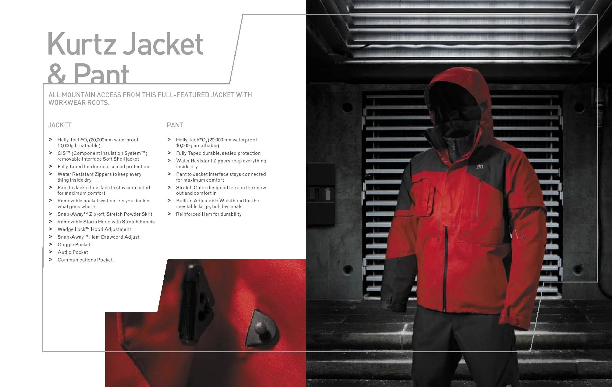
Launch product booklet: spoke straight to the core of our new direction for Helly - Between Human Will and Nature’s Forces. The battle is no longer external; your clothes and equipment will meet whatever challenge you face. It’s all up to you now, so what are you REALLY capable of? (navigate with the arrows below).
The Direction…
Complete with refreshed logo, Helly’s new identity centred around their three core aspects: Work. Survival. Sport. A single thought was needed to tie them together under the same roof and ‘Go Further’ was born - 5 years before Ford Australia began using it, though our version was only used in Europe and North America. The line was intended to evolve with each season. Go Further might turn into Further Still, Go On etc. Not so much a strap line as a seasonal call to action with the same base thinking, really.


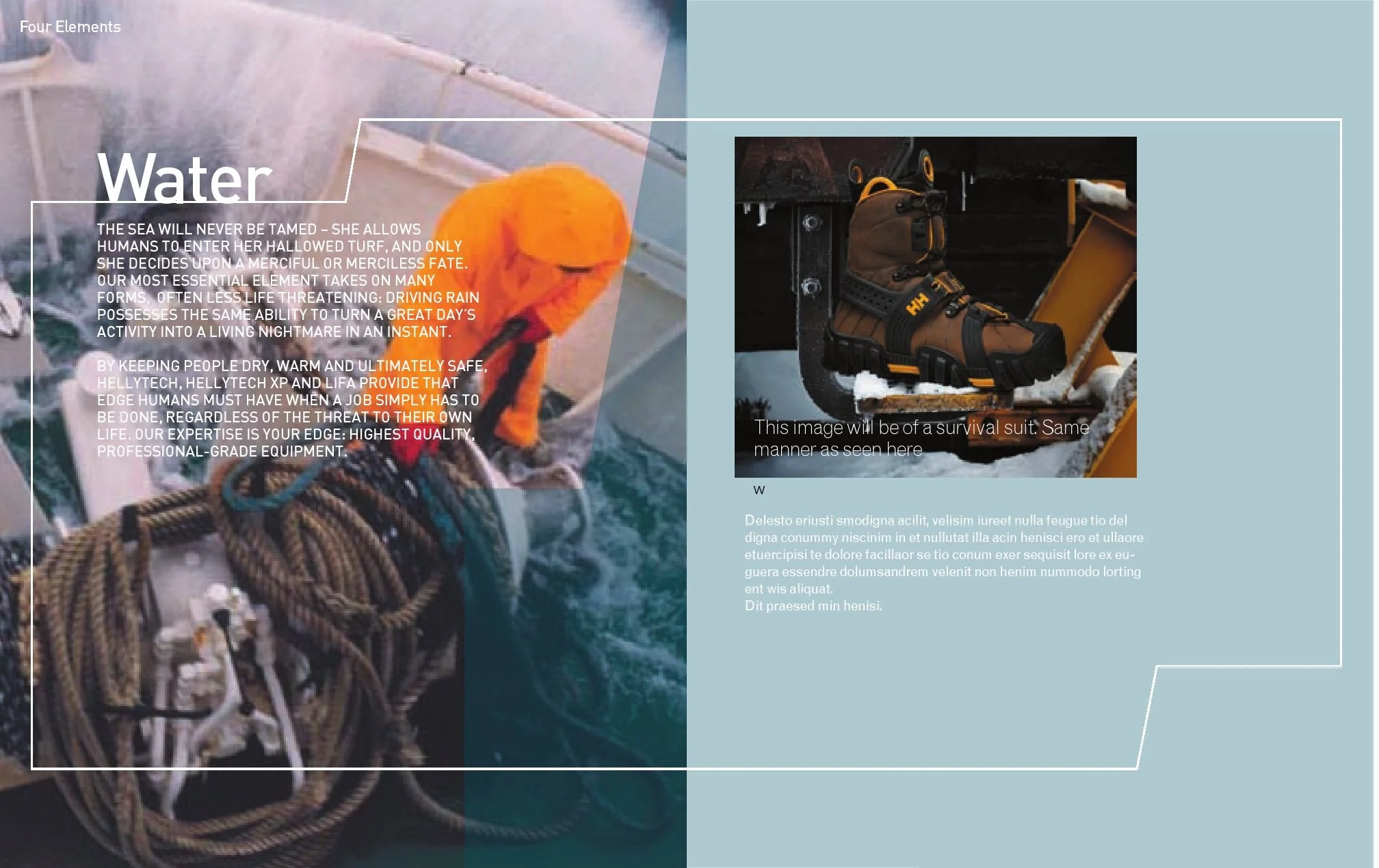

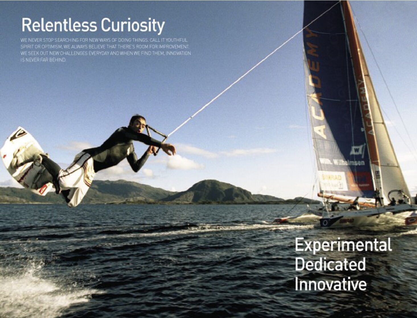
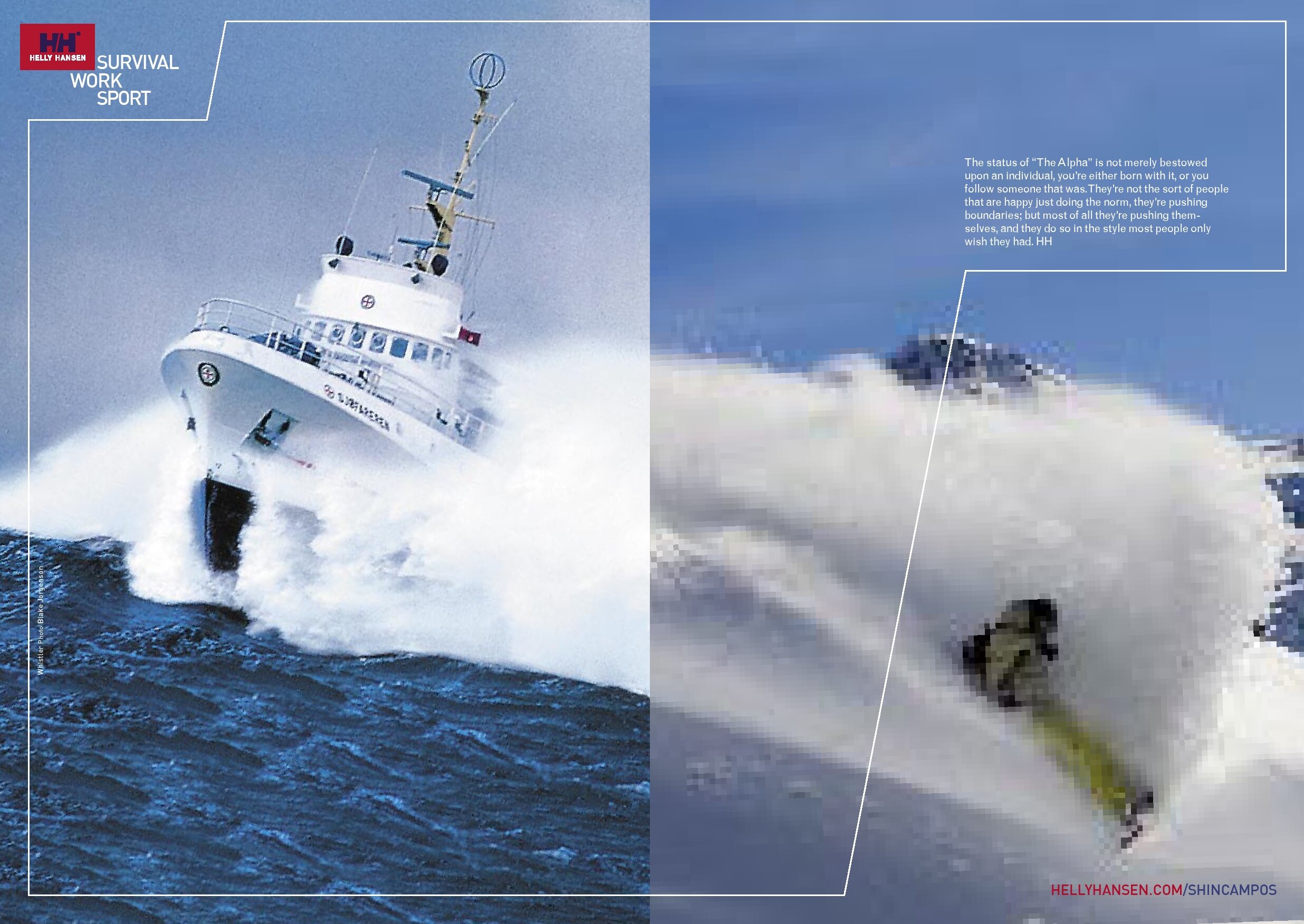


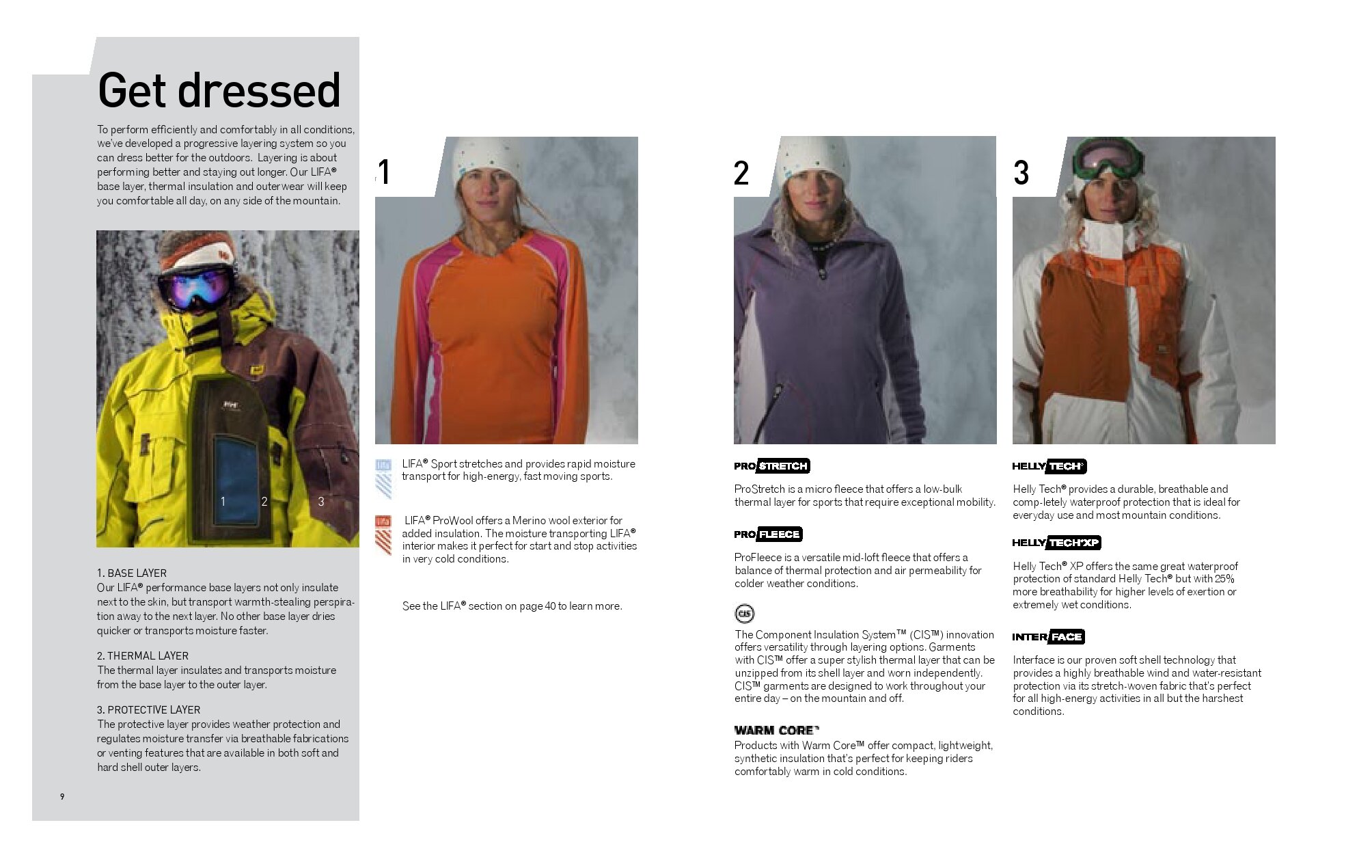


Sports magazine ads - a few examples of our new approach to sports advertising. As snowboarders/skiers and surfers are not that far apart in regards attitude, worldview and sense of humour, we opted for playful and adopted a surf magazine editorial-style approach to messaging.


